Beauty lies in the natural rythm of elements as they were through our lives and dwellings.

To the optimist, the glass is half full. To the pessimist, the glass is half empty. To the engineer, the glass is twice as big as it needs to be.

“Being a Project Manager is like being an artist, you have the different colored process streams combining into a work of art” – Greg Cimmarrusti

“When you’re building a room, you’re building character, and character is the strength and wisdom of a home.” – Rose Tarlow

Humans need continuous and spontaneous affiliations with the biological world, and meaningful access to natural settings is as vital to the urban dweller as to any other.

Tuesday, February 19, 2013

The Park Hotel Hyderabad - High Performance Design with local culture


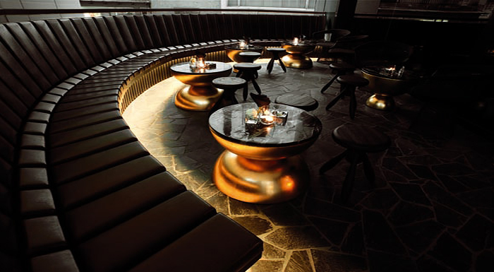
Skidmore, Owings and Merrill (SOM), the New York-based architectural firm, has recently completed The Park Hotel Hyderabad, the flagship hotel for The Park Hotel Group. This 531,550-square-foot, 270-room hotel infuses a modern, sustainable design with the local craft traditions, and is influenced by the region’s reputation as a center for the design and production of gemstones and textiles.


Roger Duffy, SOM’s Partner in Charge of the project, says, “This building signals our commitment to creating a design that simultaneously felt at home among the exuberant vernacular architecture of Hyderabad, while simultaneously incorporating the latest sustainable strategies and technologies.”
The project is distinctive for its profound implementation of sustainable design strategies, with special attention paid to the building’s relationship to its site, daylighting and views. Solar studies influenced the site orientation and building massing, with program spaces concentrated in the north and south facades, and service circulation on the west to reduce heat gain. The hotel rooms are raised to allow more expansive views, situated on top of a podium comprised of retail spaces, art galleries, and banquet halls open to guests and visitors.

The building’s three sides wrap around an elevated central courtyard that can be accessed from the hotel lobby. This flexible outdoor area is protected from strong winds, and serves as an extension of the restaurants inside. It features a private dining court and a swimming pool, which can be seen from the adjacent areas and the nightclub below, with moving patterns formed by light passing through the pool’s water. The outdoor courtyard was designed to be a multifunctional space accessible from the lobby, restaurants, and bar that surround it. Elevated three stories above ground, this veranda provides views to Hussain Sagar Lake and the city.

                                  
The facade provides a range of transparency according to the needs of the spaces inside. Perforated and embossed metal screens over a high-performance glazing system give privacy to the hotel rooms while allowing diffused daylight to enter the interior spaces, and provides acoustic insulation from trains passing nearby. The opaque areas of the cladding shield the hotel’s service areas from public view. The shape of the facade’s openings, as well as the three-dimensional patterns on the screens themselves, were inspired by the forms of the metalwork of the crown jewels of the Nizam, the city’s historic ruling dynasty.
Priya Paul, Chairperson of Apeejay Surrendra Park Hotels which owns The Park brand, describes The Park, Hyderabad as “a Modern Indian Palace, something refreshing and different that speaks to the aspirations of India today.”

Collaboration with manufacturers, fabricators, and researchers played a vital role in developing this low-energy prototype building, with data gathered in collaboration with the Stevens Institute of Technology’s Product Architecture Lab in Hoboken, New Jersey. As a result, the design team was able to reduce the building’s energy use by twenty percent. In addition, an on-site water treatment facility and sewage treatment plant process both gray water for reuse and waste water for release back into the city’s sewer system.

The project achieved the first LEED Gold certification for a hotel in India, and has been awarded Best New Hospitality Project of 2010 from Cityscape India. It also served as a case study for using a collaborative process to achieve an environmentally efficient design in Design Principles and Practices: An International Journal in 2009, and was the subject of a white paper written by the design team on the high-performance curtain wall system.


The orientation of the building on its site and the design of the metal screen have reduced energy needs of the hotel by almost 30 percent, say the architects. Because of such strategies, in late 2010, the Park Hotel became India's first LEED Gold certified hotel.

To come into the hotel is to leave behind the bustle, sprawl, and dust of the city and enter a magical, beautifully crafted space. The nuanced gestures of the design connect the inside to the outside, the building to the city, and the site to the lake. The translation of the diverse challenges of energy savings, climate, privacy, and symbolic allusions to place have resulted in a singular work. The hotel's success in responding to its environmental and cultural contexts can be attested by the reaction of the client: Paul has enlisted SOM to design another Park Hotel in Calcutta.


Monday, February 18, 2013

Sadhguru's Today's Message - 18.02.13


Saturday, February 16, 2013

Sadhguru's Today's Message - 16.02.2013


Mystic Chalet Interiors


A chalet is a type of building or house, originally from Europe, made of wood, with a heavy, gently sloping roof with wide, well-supported eaves set at right angles to the front of the house. However, the modern version of a chalet is equally interesting, so here are some design inspirations of a modern chalet with amazing concepts reflecting elegance and mystic ambience.


 The use of wood, suede, fur and antique accessories along with modern technologies and natural materials makes it quite aspiring and interesting. The designer Nicky Dobree has done an excellent job on this chalet creation. He has given it a feel of modern facilities combined with the simplicity of mountain living. Enjoy the dark interiors of a beautiful chalet!


Designing with Black or Dark Gray as dominant colors


Why is it that some spaces look gorgeous and elegant with a predominance of darker colors while others look drab, cold, too small or ‘too dark’, more than anything else?


There following are several of the key factors to consider when using black or dark colors in designing a space:

1) Size
The space needs to be large enough to augment the dark colors with other design elements.  If the room is too small it will feel even smaller with a preponderance of dark colors.  Sometimes all that is needed is a dark accent wall to stretch a space and make it feel bigger if the room is small.

2)  Lighting
Lighting is absolutely essential for darker interiors. Cove lighting, chandeliers and glass blown lights are great choices for dark interiors. The right chandelier can add color, warmth and elegance amidst a dark backdrop.  If a space is long with a window at one end darker walls will create an even narrower feeling. In this case you would want to put a mirror at one end if possible.

3) Organic elements
To warm up a space with darker colors incorporating natural wood, stone, brass, glass or colorful art is key. Glass refracts light and is perhaps one of the reasons the right chandelier looks amazing in dark interiors.  A well placed colorful painting can become more of statement on a dark wall.

4) Texture
The textural consistency of a surface or object will affect how the color displays.  The rougher the surface, the darker materials will look because they will absorb light and color.   On the other hand shiny surfaces will reflect light and create additional luminance.  Certain fabrics such as velvet will cast small shadows within themselves and appear darker than silk fabrics of the same color value and hue.

In general, the closer in light values two elements are, the lesser the contrast produced.  A dark piece of furniture such as a chair or table against a lighter background will produce a dramatic effect, but it will not have as much contrast as a lighter object against a darker background.  This is often why designers will select iconic lighter pieces in darker interiors.


Amazing campus of Bill & Melinda Gates Foundation


Adjacent to the Seattle Center and its towering Space Needle, a sprawling asphalt parking lot covered fertile ground that once had a rich history. The 12-acre site had been a clearing in a forest with a wetland that provided respite for migratory waterfowl traveling the Pacific Flyway; it had also been a meadow where Native Americans held community potlatch ceremonies. Over the years, the site was built up to house, at different times, railway trestles, homesteads, farming, a street-car barn, and a bus barn.

Designed by NBBJ, it is one of the world's most eco-friendly buildings with a solar energy system on the roof. 
 In spring of 2011, the urban plot became home to the new Bill & Melinda Gates Foundation campus, which incorporates natural and structured elements to attract wildlife and support the foundation’s mission to help people lead healthy, productive lives. Parking structures support two acres of vegetated roofs that help return 40 percent of the 900,000-square-foot campus to green space with bird-friendly habitats and edible plants such as blueberries, huckleberries, and red flowering currant. A large central courtyard beckons geese and herons with textured paving and native plantings anchored by a reflective pond.

 The total design and construction cost for the new campus is $500 million. Bill and Melinda made a personal contribution of $350 million in 2009 to off-set the construction cost of the new campus.

“The habitat restoration is one of the project’s most wonderful aspects,” says Margaret Montgomery, AIA, principal and lead sustainable designer at NBBJ, the Seattle-based architecture firm for the project. “Almost immediately, the site became a stopping place for migrating birds between Lake Union and Elliot Bay. It’s very urban, but it allows humans and nature to cohabitate.”

The office wings accommodate up to 750 people each, with three buildings spreading across nearly 640,000 square feet of occupied space. Floor plates that are 65 feet wide position all employees within 30 feet of incoming daylight, and 10-foot-high curtainwalls leverage outdoor views. The offices also welcome visitors and grant recipients throughout the year.

The campus includes 900,000 square feet in two six-storey office buildings. It sits on 12 acres.
The Gates Foundation wanted to address its larger environmental footprint. “We grounded our sustainability strategies in what was right for the project, then back-checked our goals against the LEED rating system,” Montgomery says. “When we discovered we were very close to LEED Platinum certification, we pushed ourselves just a bit further to document what we had done.” The effort paid off: The project is the world’s largest nonprofit LEED-NC Platinum building and the second-largest LEED-NC Platinum building in the United States.

Protecting the Puget Sound watershed was also a high priority. The site’s former parking lot discharged 11 million gallons of polluted rainwater into the watershed every year. A combination of efficient plumbing fixtures and rainwater collection and reuse strategies completely eliminates all polluted rainwater runoff and reduces the building’s potable water use by 79 percent compared to the Energy Policy Act of 1992.

The campus has a water storage system underneath its surface with a capacity to hold 750,000 gallons.
 Two underground parking garages (one for the Seattle Center and one for the foundation) have expansive vegetated roofs covered in sedum that absorbs rainwater runoff and blooms at different times of the year to provide swaths of color for onlooking building occupants. A 1-million-gallon rainwater storage tank fills in approximately 11,000 square feet of unused space on one level of underground parking. The tank collects and filters runoff from nonvegetated roof and hardscape areas for use in irrigation, reflecting pools, and toilets.

The energy-efficient systems have reduced the total energy usage of the facility by 40 per cent.
 Because cooling towers require tremendous amounts of water, the project team found another way to cool the buildings. A second underground tank, 60 feet tall and 50 feet in diameter, holds 750,000 gallons of water for thermal-energy storage. At night, plate-frame heat exchangers push chilled water pipes into the tank to bank it for daytime use. When the buildings are occupied, the heat exchanger pulls the chilled water from the tank and transfers it to the air-handling units to circulate cool air. Cooler nighttime temperatures allow the units to operate at lower pressures so they use less energy than during hot days.

Hydronic radiant heating is embedded in the concrete floor slab of the campus’s four-story atrium, where operable windows provide cooling and ventilation. The remaining occupied spaces rely on an underfloor air-distribution system that draws water from the chilled-water tank and heat from a gas-fired condensing boiler plant. Montgomery says that underfloor air can be delivered at a lower velocity and a slightly higher temperature since it enters the space at the floor level. “This allows us to take advantage of free cooling and save energy. The strategy also provides high indoor air quality because the air doesn’t have to mix in order to deliver ventilation or thermal comfort heat or cooling where it’s needed. It rises gently through the space and gets exhausted at the ceiling.”

 The campus was built as a long-term investment to ensure it remains a viable, efficient workplace
 for today and in decades to come.

On top of the wing housing the cafeteria’s kitchen and campus shower rooms, the team placed 47 evacuated-tube solar-hot-water collectors so that solar-heated water can flow directly to the sources without conversion. The system reduces natural-gas consumption for heating water by 4,750 therms annually and provides energy for approximately 36 percent of the domestic hot-water use.

Combined, the multiple energy-saving strategies lowered energy consumption by 39 percent compared to the ASHRAE 90.1-2004 baseline. The foundation will recoup its investment in energy- and water-related systems in less than 30 years.

 There is an under-floor air distribution system for ventilation, which conserves energy and facilitates 
future space modifications.

“Creating a 100-year building gave us the ability to look at a longer-term payback and do some forward thinking,” Montgomery explains. “The underfloor air-ventilation system simplifies future space modifications, and we designed the roofs to accommodate photovoltaic panels when future technology makes them more financially feasible in Seattle’s climate.”

The campus design will include open green spaces and 
the design ensures natural light in the building. 


An Oasis at the Sahara

 
One year after it closed, can Sahara site become a symbol of Las Vegas’ rebound?

It's only fitting that a developer is planning a new oasis for Las Vegas to replace a project called the Sahara.

The developer SBE announced today the groundbreaking for SLS Las Vegas, a new $415 million hotel and casino remodeling project being undertaken by Philippe Starck and Gensler. The development is an adaptive reuse of the Sahara, a casino and hotel whose failure in 2011 is only part of the reason that the SLS Las Vegas is a gamble. 

The old Sahara
   
 SLS Las Vegas will feature more than 1,600 rooms and suites, with interiors by Starck. Gensler is overseeing the remodeling of some 2.2 million square feet of space, including a 66,000-square-foot casino that will occupy a single level.

For a full-scale remodeling of the hotel that served as the set for the 1960 film Ocean's Eleven, the developers of SLS Las Vegas are working to play down expectations. "Our plan will be to deliver a product that is affordable and approachable," SBE founder and CEO Sam Nazarian told Bloomberg Businessweek last year. "We are going back to the roots of Las Vegas."

Roots doesn't necessarily mean humble: The program for SLS Las Vegas includes a new restaurant by José Andrés and a 10,000-square-foot Fred Segal retail store. Senate Majority Leader Harry Reid (D-Nev.) is stumping for the project. The global Starck brand, which is doing interiors for the Gensler-designed rehab, was responsible for the 1994 renovation of the Delano Hotel—one of Miami's most celebrated hotels.

 Perhaps SBE is getting back to roots in Vegas by taking on a project with a fair amount of risk involved. When the developers sought financing, Moody's gave the project a "risky" debt rating. The payoff, however, could be profound for the Entertainment Capital of the World. Las Vegas Sun columnist J. Patrick Coolican outlined the ways that SLS Las Vegas could up the ante for the entire north end of the Strip: "If the new property attracts the buzz and the crowds of, say, the Cosmopolitan, we might see Carl Icahn do something with the Fontainebleau site. And maybe MGM Resorts will do something with the land it owns. Or sell it to someone who will."

The developers are also betting that the economy will continue to rebound and that, by the hotel's opening in 2014, Las Vegas will be enjoying an unquestionable economic recovery. As Coolican notes, recovery won't mean a return to megaresorts. Despite the risks today, adaptive reuse may prove to be the surest bet as the recovery continues.


 source


Friday, February 15, 2013

Kareena Kapoor’s glamorous journalist avatar in Prakash Jha’s Satyagraha

People say that Kareena Kapoor has started looking like a begum after ‘Khan’ got attached to her name. And perhaps they are right. This image from the sets of Prakash Jha’s Satyagraha displays a regal aura around this glamorous lady. Is this the ‘Saif Ali Khan effect’? We would like to think so!

What’s more, we know that Bebo is playing the role of a television journalist in the movie and she totally looks the part with an identity card (probably with PRESS written all over it) around her neck. Also, we can’t help but notice the glass Kareena’s holding in her hand. What does it contain? Looks like nimbu pani, no? And maybe that’s Bebo’s khoobsurti ka raaz. Wink, wink. Care to share the secret with us, babe?

Rani Mukerji plays a journalist in Bombay Talkies

After No One Killed Jessica, Rani Mukerji is set to don the garb of a journalist once again for Bombay Talkies. The film is a bouquet of four stories directed by different directors – Anurag Kashyap, Karan Johar, Zoya Akhtar and Dibakar Banerjee. It is an ode to 100 years of Indian cinema.

The story directed by Karan features Rani, Randeep Hooda and Saqib Saleem. Both Karan and Rani have been best friends ever since the actor made her debut in the film industry with Kuch Kuch Hota Hai and have shared a long professional relationship.

“Rani will be essaying the role of a journalist in the movie. She is paired opposite Randeep. The duo are sharing screen space for the first time,” the spokesperson of film said in a statement. Added the source: “Rani was briefed on her character nuances by Karan. She effortlessly got into her character.”

Congress leaders ask FM to raise IT exemption limit

Increasing subsidised cooking gas cylinders from nine to 12, more jobs, curbing price rise and providing income tax relief to the salaried class were some of the wishes Congress leaders shared with Finance Minister P. Chidambaram Thursday during his pre-budget consultations, said party leaders.

"Issues like farm sector, minorities, tribal development, education and infrastructure sector were raised. Out of the 46 leaders present, 32, including Chidamabaram, spoke," Congress general secretary Janardan Dwivedi told reporters after the two hour long meeting.

Briefing the leaders, Chidambaram told the leaders that the Indian economy was undergoing a difficult period and the global recession has impacted the growth rate.

He said former finance minister Pranab Mukherjee had tried to arrest the decline in the Indian economy in 2008-09 through a financial stimulus.

"Chidambaram highlighted that the fiscal deficit has to be controlled," said a Congress leader who was present in the meeting.

Senior leader Ajit Jogi talked about tribal development and the need to push development projects in the Maoist-affected areas.

General secretary Oscar Fernandes wanted more gas reserves to be found to reduce India's dependence on oil imports.

Suggestions about increasing the budgets for minority welfare, child welfare and education development departments were also made.

General secretary Jagdish Tytler stressed the government should focus on creating more employment opportunities with an eye on the 2014 general elections.

Demands like a rail coach factory in Jammu and Kashmir to generate local employment and focused development of the usually neglected north eastern region were also made during the meeting, said the sources.

Some leaders also wanted spending on social sector and flagship programmes to be increased.

Sadhguru's Today's Message - 14.02.2013


Thursday, February 14, 2013

"Ten New Rules for Project Managers" ~ Hal Macomber


1. Embrace uncertainty.

Expect the unexpected. There is far more that we don't know and can't know than what we can anticipate. Be resilient to what life throws at you. Anticipate that your team will learn something along the way that can and should change what you have promised and how you can deliver on your promises. And when you take a set-back — we all do sometime or another — review the other nine rules for how you can work your way out of it.

2. Listen generously.

People are able to say what they can in the moment. For the most part, people are well-intended. Give them the benefit of the doubt. Take the time to listen. Ask questions. Seek others' opinions. And while you're at it, don't be so harsh on yourself.

3. Collaborate. Really collaborate.

Make it your rule to plan with those people who will be the performers of the plan. Don't wait 'til the project has gone south to get their help. Start out that way. Continue collaborating as the usual way you work through the project.

 4. Coordinate meticulously.

A project is an ever-evolving network of commitment. Keep that network activated by tending to the critical conversations. See that people are making clear requests, promises that have completion dates, and share opinions that advance the purposes of the project. Without attention to those critical conversations the project will drift.

5. Tightly couple learning with action.

Projects are wonderful opportunities to learn. Don't put that off for the after project lessons learned. Make it your habit to incorporate learning loops in all your project activities. Your team will appreciate it. Your customer will benefit from it. And best of all, it will make your job easier.

6. Build relationships intentionally.

Project teams come together as strangers. To do great work…innovation, learning, and collaboration…all take people who like and care for each other. Don't leave that to chance. Start your projects by building relationships among team members.

7. Keep your eye on the overall project promises.

Project work can be difficult. It is easy to loose sight of what we are doing and why we are doing it. Remind your team and yourself of the overall promises and how you are doing fulfilling those promises.

8. Take care of your project team.

We've come to accept that the customer comes first…the customer is always right. We can't take care of the customer if we first aren't taking care of our project team. It's a challenge. While there are some things we can do for the whole team, it comes down to taking care of each team member as the individual that he or she is. And to make it more difficult, then we must bring their various interests into coherence.

 9. Stay close to your customer.

Clients' concerns evolve over the life of a project. Take advantage of that to over-deliver. Stay in a conversation with your client to adjust what you are doing.

10. Adopt practices for exploring a variety of perspectives.

We think we see what we see, but we don't. We really see what we think. Remember the blind men and the elephant. Make it your habit to inquire what others see. You'll see more together.

A Humble Snack Gets to Shine - Almond Tikki

Ziya’s almond tikki.

MUMBAI — When Vineet Bhatia was a hotel management student in New Delhi in the 1980s, he would regularly snack on aloo tikki at local street stalls.

“It was the cheapest thing you could eat: chickpeas and potatoes,” says the Mumbai-born chef, “and it was absolutely divine.”

Mr. Bhatia elevates this north Indian roadside staple at Ziya, a restaurant in Mumbai’s Oberoi Hotel that he has managed since 2010. The result is the almond tikki, a dish that combines hot and cold, sweet and spicy, crisp and soft. “It’s something that tickles your palate,” says the 45-year-old chef.

His blend of traditional Indian flavors and contemporary Western technique has made him the first Indian chef to earn a Michelin star, first at Zaika in 2001, then at Rasoi in 2006, the London restaurant he still helms.

Here is how Mr. Bhatia’s almond tikki comes together:

The patties: In keeping with the original recipe, humble mashed potatoes are the central ingredient. In Mr. Bhatia’s version, however, the potatoes are boiled in water flavored with turmeric, cumin and salt. He adds green peas to the mash, along with more cumin, garlic, ginger and fresh coriander, before making them into burger-sized patties.

Almond flakes: The patties are coated with almonds, not an ingredient you’d find in the classic street-side aloo tikki. Inspired by almond crusts on Western-style chicken and fish dishes, Mr. Bhatia says he wanted to make the patties crispy. “All these textures are very important for the palate,” he says.

Street food essentials: Spicy chickpeas and yogurt are the staple accompaniments to roadside snacks in north India, and they’re part of Mr. Bhatia’s dish too. The chickpeas are cooked with tomatoes, garlic and ginger. Before serving, he adds onions, chopped coriander and a squeeze of lemon. The yogurt, which coats the patties, is sweetened with sugar and, in Mr. Bhatia’s twist, a dash of ground cardamom.

Chutney sorbet: Rather than serve a typical thick, tamarind chutney, Mr. Bhatia lightens things up with a sorbet. He cooks tamarind with jaggery, an unrefined palm sugar, as well as masala spices for over an hour. The solution is strained, reduced over heat into a thick custard, then churned in an ice-cream maker.

Final touches: The almond-crusted patty, covered with sweetened yogurt, is placed in the middle of the plate and garnished with chickpeas around it. The dish is then topped by a scoop of the sweet and tangy sorbet. The question Mr. Bhatia wants guests to ask is: “How is the sorbet on top of the hot cake but still not melting?” The answer lies in the papdi, a thin fried chip, which separates the two.

Already a more complex mix of flavors, textures and temperatures than the street version, the towering presentation is also prettier than classic aloo tikki, which is traditionally served in disposable plates made of dry leaves. “This is all designed to please the senses,” says Mr. Bhatia.
Ziya, The Oberoi, Netaji Subhash Chandra Bose Road, Nariman Point

SANGATH - The Architect's Office in Ahmedabad, India


Sangath is an attempt to reinterpret the rich architectural traditions of India and find their resolution in contemporary architecture, where a perennial search for Indian ethos and contextual idiom finds its answers. Gradual unfolding of spaces through shifting axis, inbuilt thresholds and sense of layering are key attributes of space organisation.


The non axial route of movement makes it exploratory with built in surprises where every change to alignment makes one pause, ponder and reorient oneself. This makes it interactive with involvement to onlooker and an instantaneous rapport is established between him and the subject.

From arrival, the immediate space is actually approached last with a total three hundred and sixty degree movement loop. Here each turn, each pause, each node unfolds newer nuances for experiential enrichment and visual impact.


 __________________

INTRODUCTION:
  • SANGATH means “moving together through participation.”
  • It is an architect  office
  • Location:   Thaltej Road, Ahmedabad 380054
  • Client:    Balkrishna Doshi
  • Period of construction:  1979-1981
  • Project Engineer:  B.S. Jethwa,   Y. Patel
  • Site area:   2346 m2
  • Total Built-up Area:    585 m2
  • Project Cost:    Rs. 0.6 Million ( 1981 )
Passive Design:
  • Not require mechanical heating and Cooling
  • Reduces greenhouse gas emissions from heating, cooling, mechanical ventilation and lighting
  • Take advantage of natural energy flow
  • Maintain the thermal comfort
Design concept And Features:
  • Design concerns of climate ( temperature or humidity or sunlight).
  • Extensive use of vaults
  • Main studio partly bellow the ground (sunken)
  • Very less use of mechanical instrument
  • Special materials are used resulting in a low cost building costing it
  • Lot of vegetation & water bodies
  • Continuity of Spaces
  • Use of lot of diffused sunlight
  • Complete passive design
  • Grassy steps which Doshi uses as informal Amphitheatre
CONSTRUCTION OF VAULT
  • 3.5 cm thick  RCC
  • 8 cm ceramic fuses
  • 3.5 cm thick RCC
  • 6 cm thick water proofing
  • 1 cm thick broken China mosaic finish
  • Ceramics are temperature resistant.
  • Broken China mosaic is insulative and reflective surface.
  • Broken China mosaic  gives a very good textures.
  • Water cascades from fountain into series of Channels
  • Glass bricks
  • Diffused light in the drafting studio
  • Whole area is covered with vegetation
  • Terracotta pots and sculpture lying in the compound
Source: